Prism Atelier — Six-Shade Amethyst, Mauve & Champagne Eyeshadow Palette with Mirror
Prism Atelier — Six-Shade Amethyst, Mauve & Champagne Eyeshadow Palette with Mirror
Couldn't load pickup availability

Prism Atelier — Six-Shade Amethyst, Mauve & Champagne Eyeshadow Palette with Mirror
🎨 Your six-color atelier
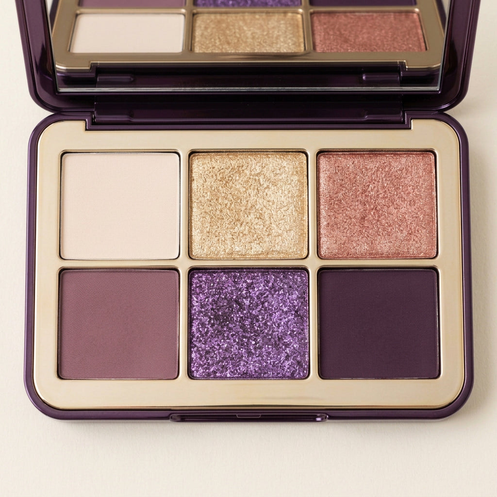
Think of Prism Atelier as a small color studio rather than a row of unrelated shades. A smoky-purple case opens to reveal six pans arranged in a clear two-by-three grid, surrounded by a champagne-gold frame. Pale neutrals give the eye somewhere to rest; mauve and plum supply structure; amethyst introduces the unexpected note.
The color map
Read the top row from left to right: ivory, champagne gold, and rose copper. These are the lighter and warmer visual anchors. On the lower row, dusty mauve sits beside amethyst and deep plum. The contrast between quiet-looking matte tones and visibly reflective pans is central to the palette's design. These names describe the six color directions shown, not six separate product variants.

Study 01: soft daytime definition
- Sweep a small amount of ivory across the lid with a clean eye brush
- Introduce dusty mauve toward the outer portion and soften the boundary with a separate blending brush
- Add a restrained touch of champagne to the center if you want a light-catching accent
- Step back from the mirror and check that the transition remains balanced on both eyes.

Study 02: rose-copper warmth
Let rose copper become the focal color across the mobile lid. Use mauve to connect the warmer center with the outer edge, then introduce a small amount of plum close to the upper lash line. Keep the amount modest at first. A brush with a smaller head gives you more control when the placement becomes more precise.
Study 03: amethyst after dark
- Start with mauve as your transition color
- Place amethyst toward the center of the lid and use deep plum at the outer corner for contrast
- Blend the junctions rather than mixing every shade into one area
- Finish by reviewing the shape with your eyes open, keeping powder away from the waterline and following the product label's eye-area precautions.

A frame worthy of the colors
The deep-purple exterior echoes the coolest shade inside, while the gold-toned dividers make the arrangement legible at a glance. An integrated mirror fills the lid. Closed, the case is understated; open, it becomes the most colorful object on the dressing table. The campaign's crystal and silk settings reinforce that contrast between precision and softness.
The listing focuses on one six-pan palette. Brushes and decorative objects are not included. Gift-box photographs illustrate presentation only unless gift packaging is expressly confirmed. Makeup images are styling references; colors may appear different on individual skin tones and screens. Ingredients, net weight, suitability, and safety directions must be checked on the physical product label.